
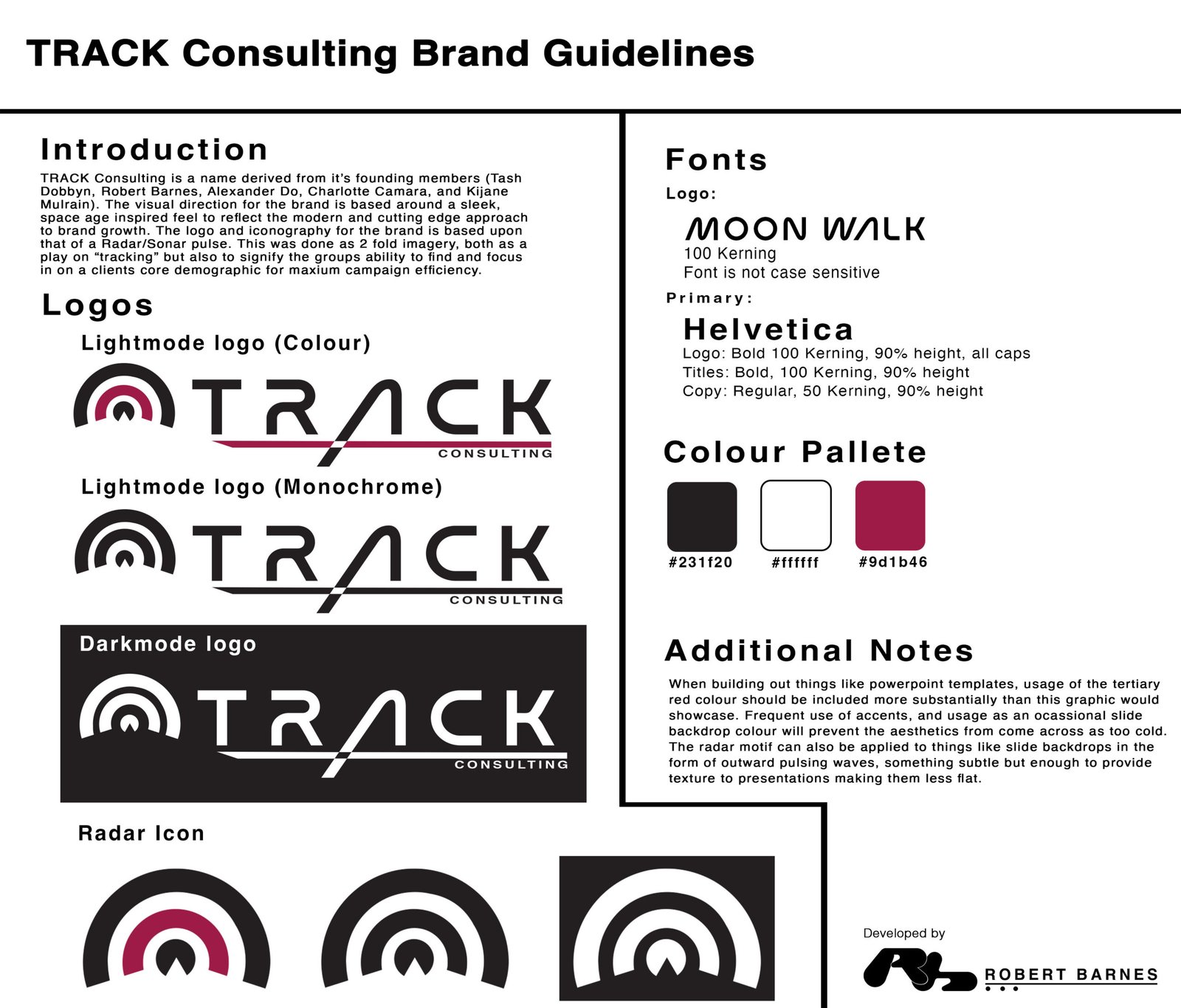
As part of our fifth semester in Sheridan College’s Marketing and Advertising Communications Management program, we were given the opportunity to create a campaign pitch in small groups for a real client (Joyburst Hydration), competing against our fellow classmates for their consideration. Part of this process was to create branding for our group, resulting in the guidelines for the fictional firm “TRACK Consulting”
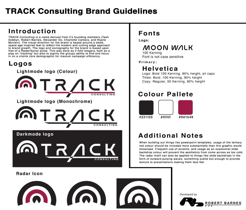
Through conversation we realized that the first initial of each team member spelled out “track”, which immediately evoked a ton of potentially useful imagery. Using that as a base, the idea of the radar iconography quickly followed, opting for a simple radar ping motif paired to an ultra-modern typeface inspired by NASA’s “worm” logo from the 1970s. The idea was that these things in conjunction with each other worked symbolically to convey a brand that used the newest techniques available to find and reach a client’s target audience.
The colour palette was a mix of intentional design choice and happy accident. We had established early on that we wanted a minimal palette with a strong colour pop to be used liberally to avoid falling into the trap of sterile design that many tech companies struggle with, and chose a slightly pale red colour to fill that need. What wasn’t explicitly agreed upon was the light shade of black, which came from a mistake exporting the logo as a vector file. While this had originally been intended to be a flat black, I realized that in combination with the red, this light black left a slightly warmer feel, and made the whole thing feel less sterile. It was a great example of how sometimes great “choices” happen totally by accident, and how we should be open to embracing those moments.
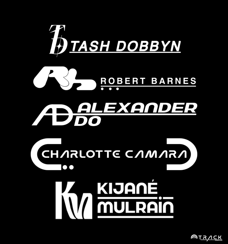
Expanding further on a previous plan I had developed for my work on AuraLink, as part of our bold visual direction on a client-facing front I thought it was valuable to provide each team member with a specific logo that could be used on something like intro sections of slide decks. The logos for myself and Tash Dobyn had already been created, and I wanted an equally bold and eye-catching direction for the others to help dial in the strong, bold, and modern direction we were chasing with the group branding at large.