
As an excercise in rebranding, we were tasked to do a rebranding campaign for Foodland Ontario (the company that pushes ontario made produce within the province). Our brief was to focus in on how Ontario produce can be used to create high-end dishes, attributing value to Ontario produce over other places. Our secondary goal was to stay in line with Foodland’s new modern style guidelines throughout the process of making this multi-formfactor print/out of home campaign.
Using recipes directly off the Foodland website, photos of these recipes were paired with scenes out of high end establishments, paried with farm land in the background depending on the medium. Using a magazine advertorial, a bus shelter, and a bus king poster, 3 concepts were developed under this direction
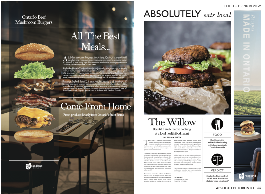
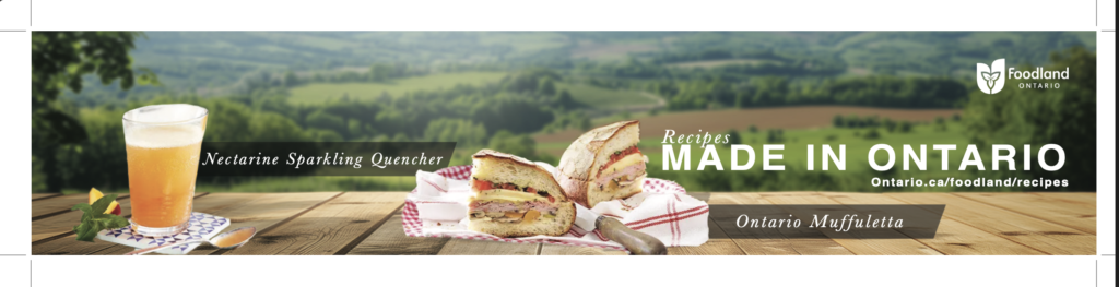
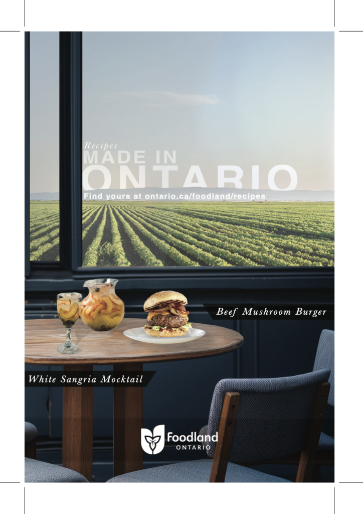
For the bus shelter and king poster, a clean sans-serif font was used to stay in line with foodlands new modern look, with a contrasting serif font used for the names of the recipes to evoke a feeling of class next to the premium recipes on display. For the advertorial this premium feel was focused in on, keeping with the general feel of the hypothetical magazine we were provided to put the ad in (that being a high end food magazine). Outside of the prolonged reading from the magazine insertion, the tagline was kept short and simple under the assumption that people would only briefly be reading them off the side of a bus or a bus stop, and that the striking visual of the good and the backdrop would grab the attention of consumers passing by, directing them to the Foodland site where these recipes could be found.