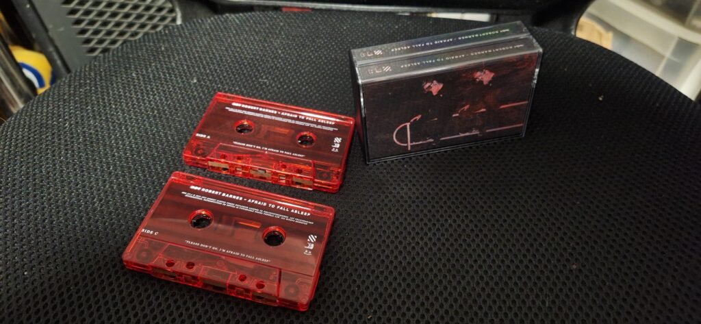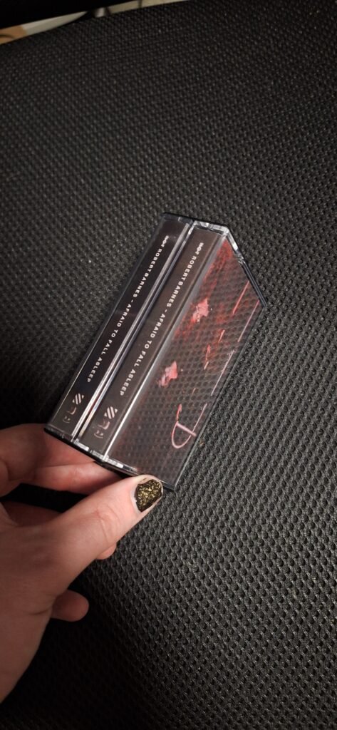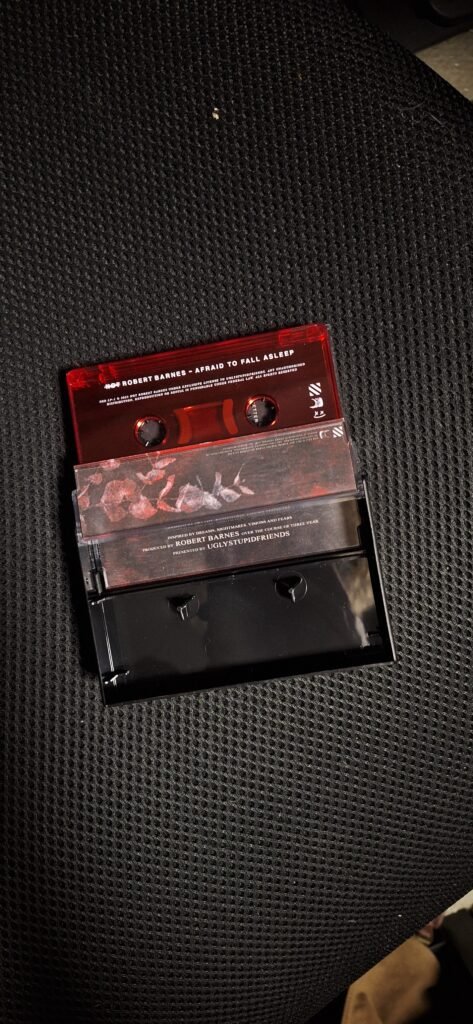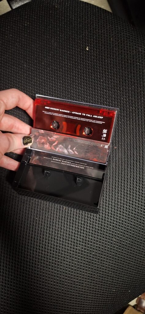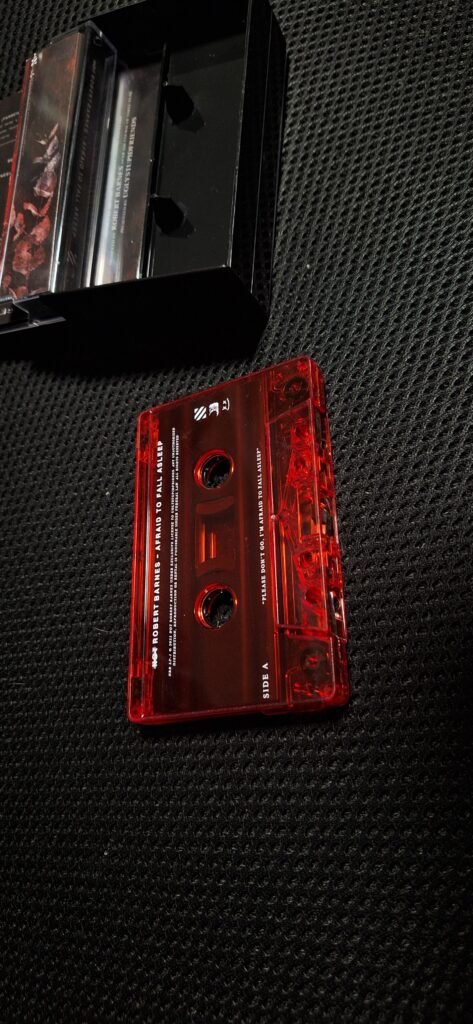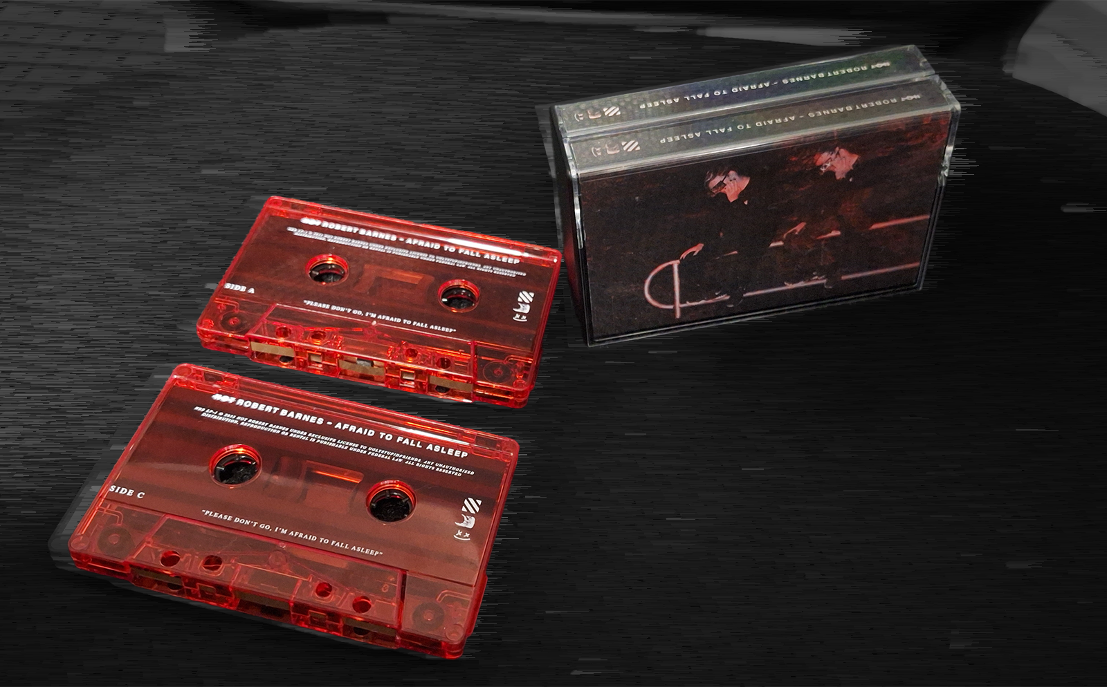
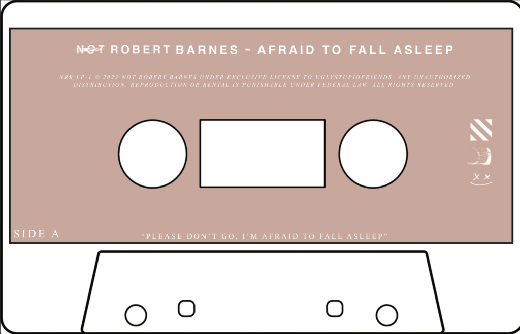
The cassette release for my 2023 album ‘Afraid To Fall Asleep’ was designed for a small print run, featuring 3 pannel J cards featuring visuals inline with the digital single rollout (album art + lyric video stylings) and 2 translucent red cassettes with white on body print.
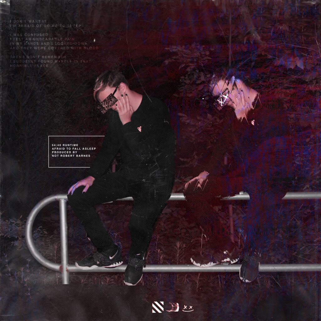
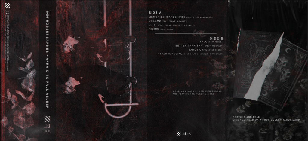
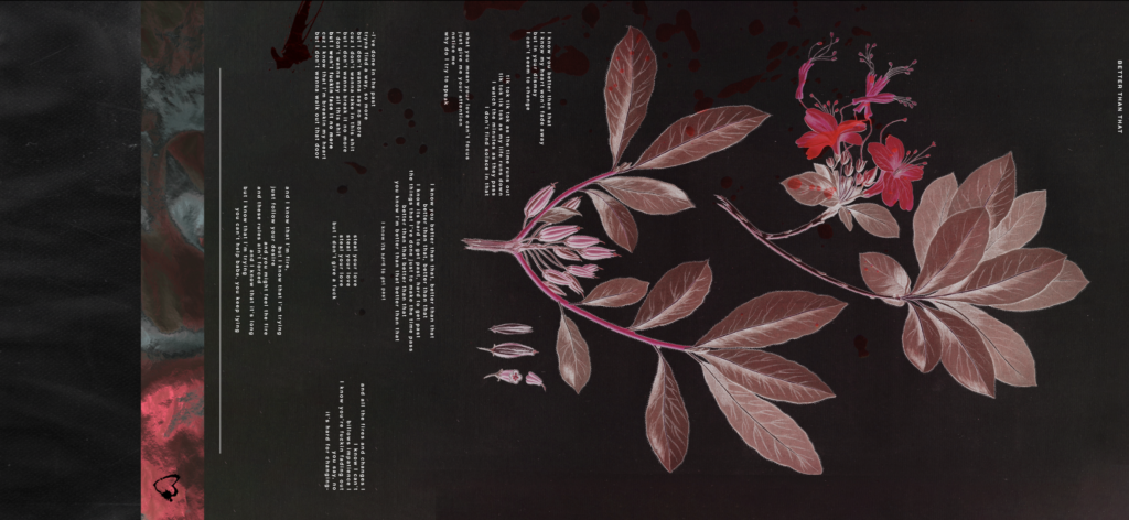
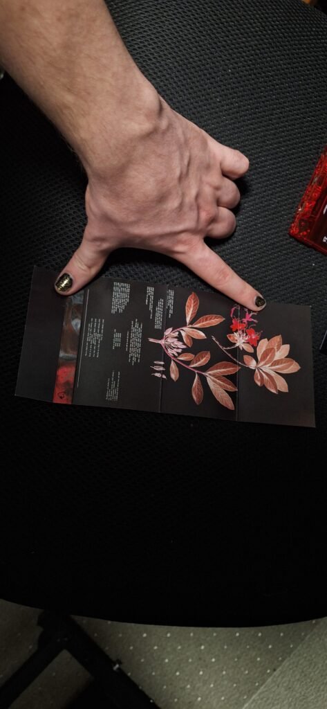
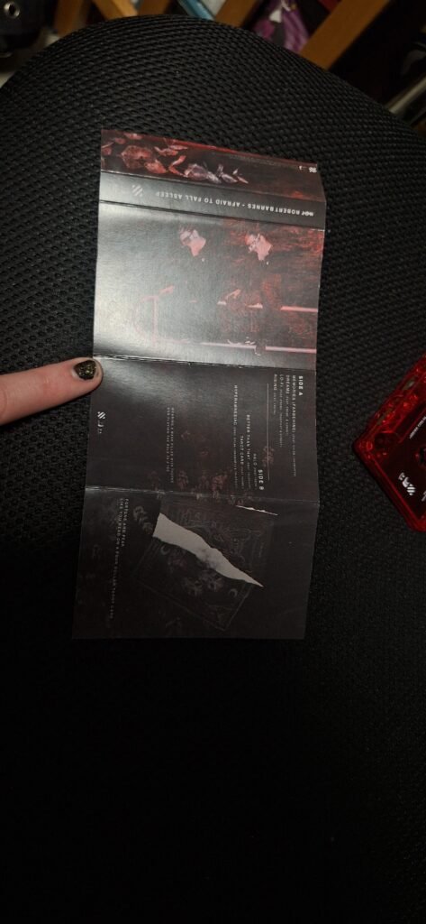
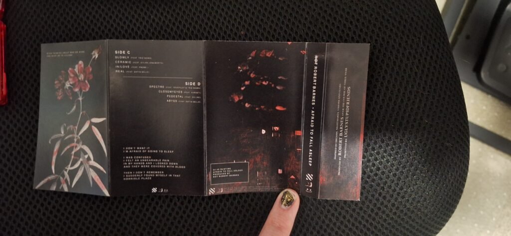
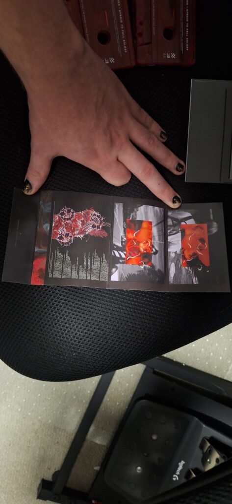
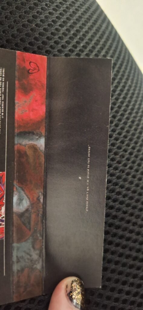
The cassette outer cover had it’s colour pallette altered from the source art, changing the base image to grayscale and removing the blue tones from the texture layer. The second pannel features the tracklist for side A and B alongside a lyric from the track “Halo”. The approach here was to blend art and functionality, making it apparently obvious what the division of the tracks was while also displaying prints of various pieces of artwork used for the album (with the third pannel featuring the custom tarot card mockups used on the art for “Tarot Card”. The inner cover featured a botanical sketch used in a concept cover for “Better Than That”, which has a direct counterpart in the art for “Spectre” which can be seen on the outer print of the C/D-side J Card
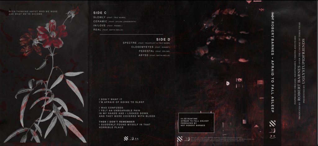
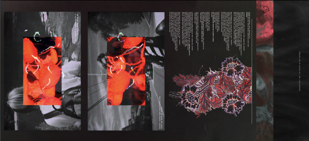
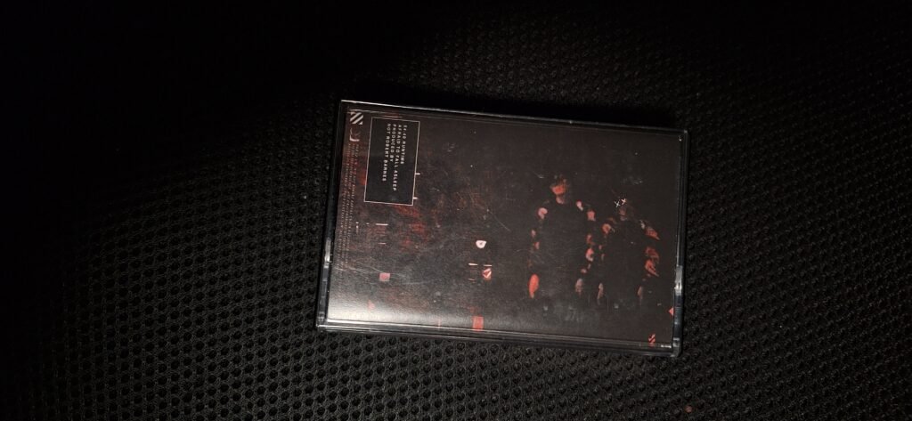
The C/D side J card featured an alternate coverart using the same body double motif used across all social media content during this time, as well as the relocated runtime/credit box from the original art. The tracklist card here features a quote from the movie “Nightmare Castle” which was a recurring sample motif accross the album, as well as the bloodied flower art used for the “Spectre” single artowork. The inner artwork features 2 stills from the lyric video for “Ceramic” paired with 2 lyrics from the track “Real”, as well as a recolouring of flower bundle printed onto ceramic, and the lyrics full lyrics to the song sharing it’s name.
The biggest focus for the cassette overall was making everything created for the album (including the artwork, videos, tie-in monologues and supplementary content) feel tangible and incredibly cohesive through their visuals. The source visuals themselves had some consistencies (mainly collour pallettes and general vibe), but piecing them together all in one place in a way that felt fluid and artistically consistent was a large task. The end result was an incredibly high quality unit with added value for the consumer