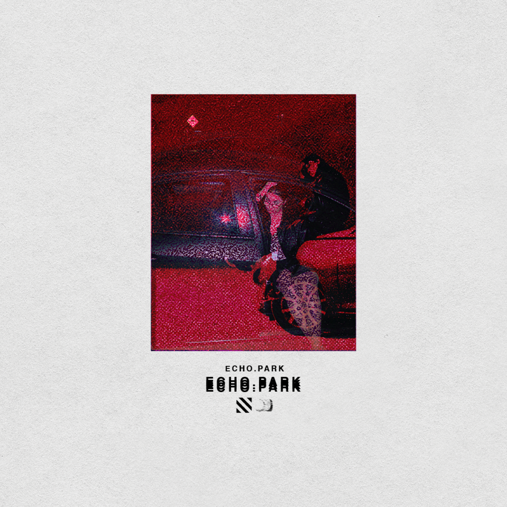
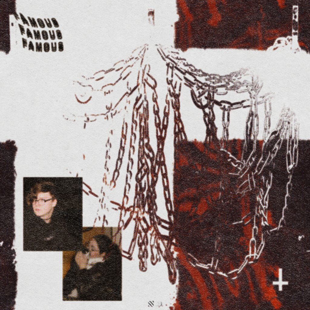
ECHO.PARK was conceptualized from the start to have a very barren aesthetic defined by how it interacted with dead space. The first concept made for it was what would later become the final artwork for the EP, featuring 2 photos of the 2 collaborating musicians (myself and Batya Belle) blended over eachother and masked with a harsh red blend. The remainder of the artwork was meant simply to frame this bold piece while featuring the words “ECHO.PARK” 3 times over in line with the echo motif.
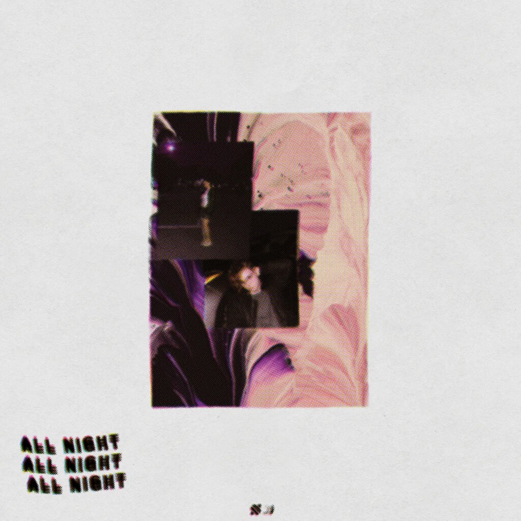
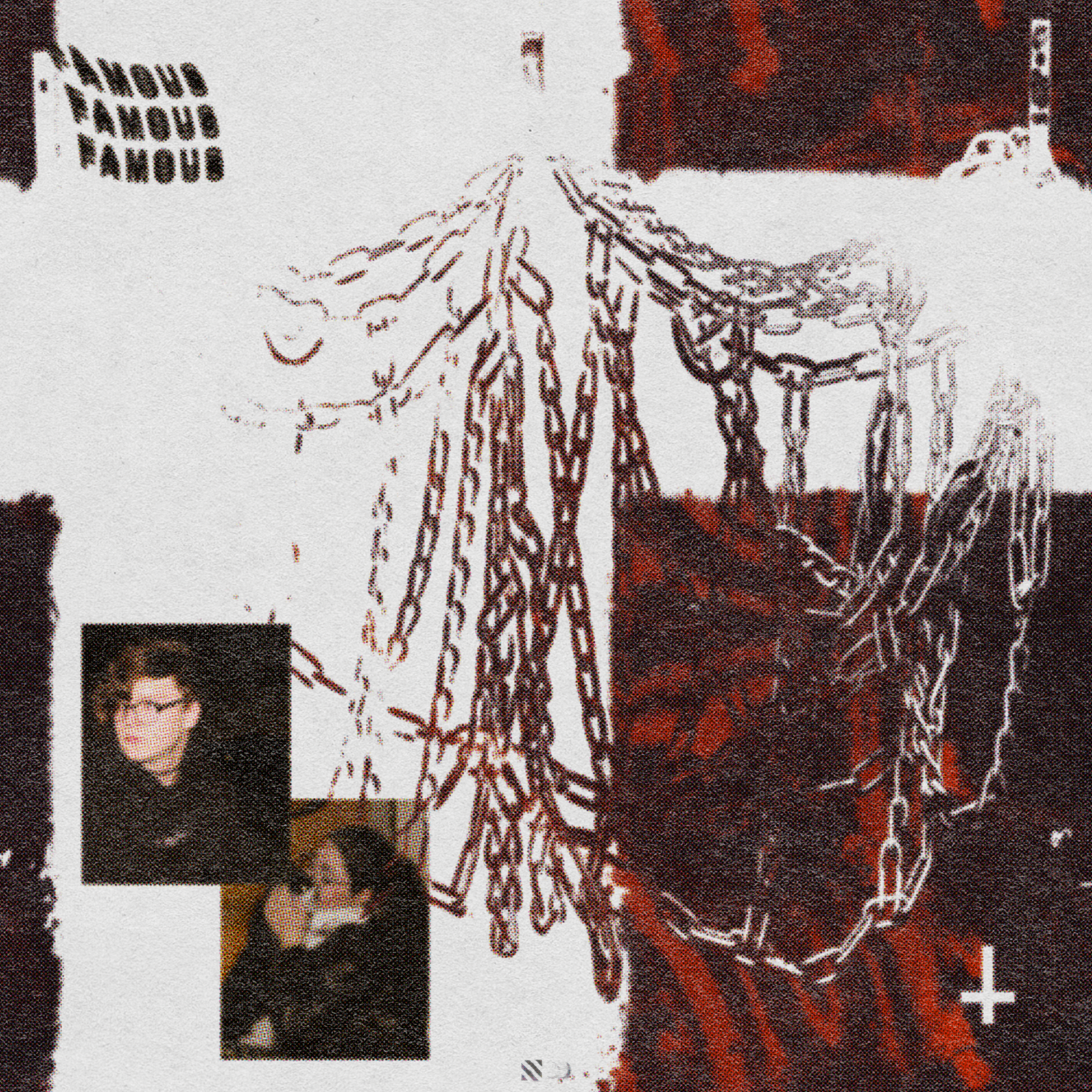
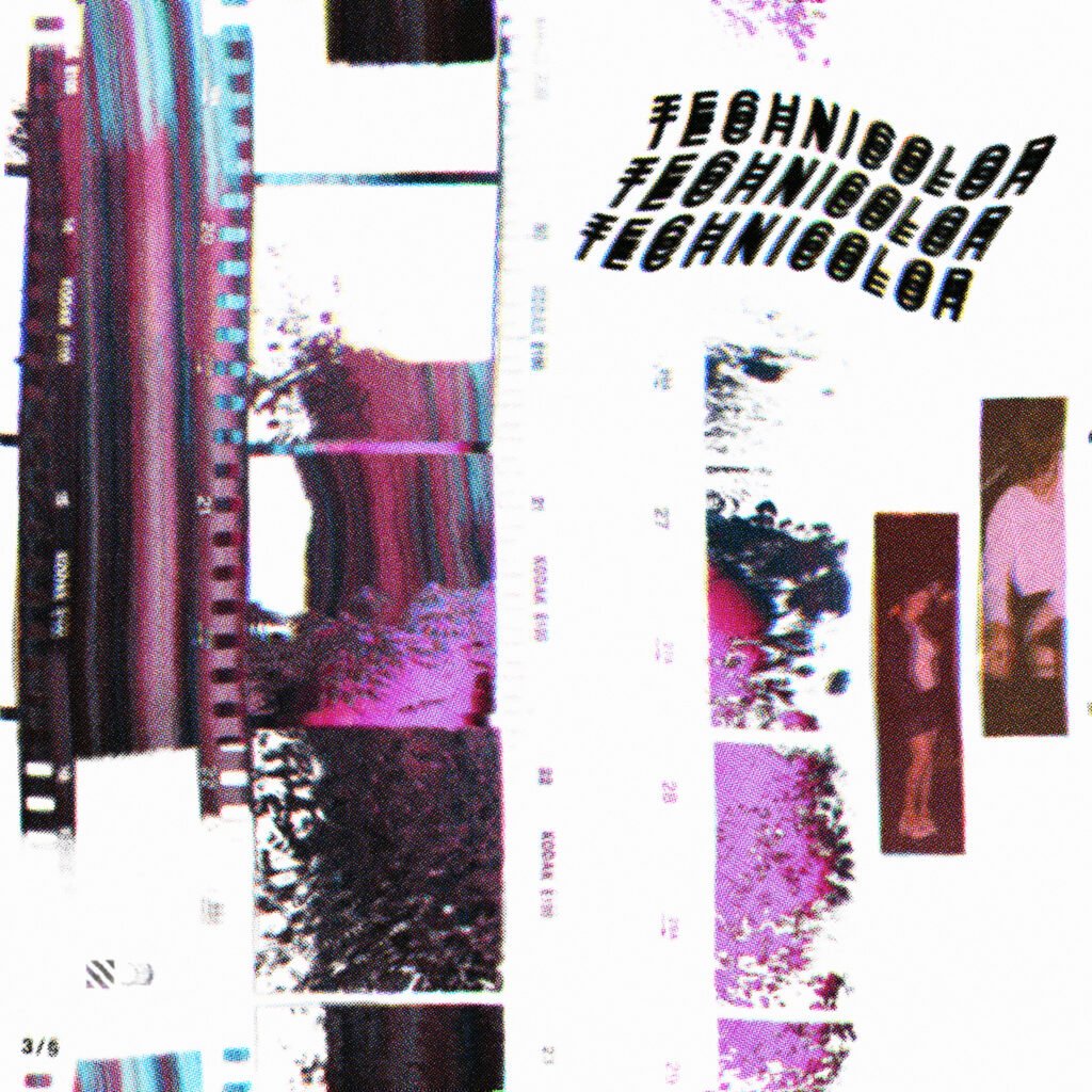
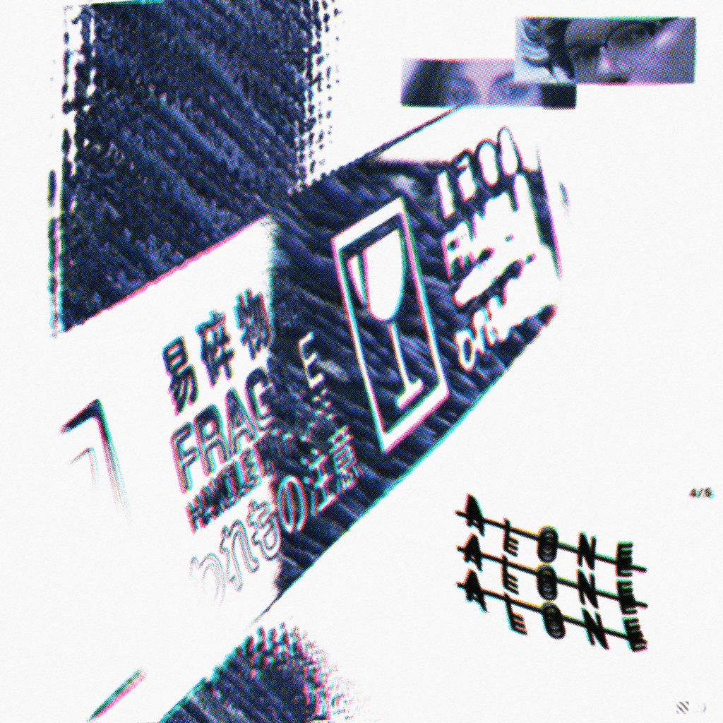
The art for the first single followed a slight evolution of this formula, but concept quickly evolved from there, transitioning from just deadspace and overlays to using displacement maps of recognizable items/textures over a solid texture of a single colour. These later artworks would become the singles, each featuring a distinct colour palette correlating to the vibe/feeling of the song.
The Balance of dead space with a bright centerpiece was mirrored in the albums video components (lyric videos and spotify canvas), as they featured full 3D environments rendered in unity, mostly featuring blank white texture to keep a clear visual focus in frame at all times
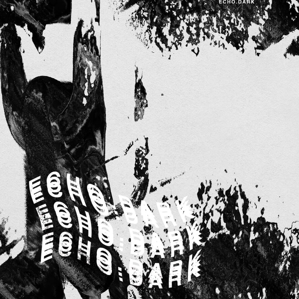
This concept was intended to be carried over into a follow-up B-side titled ECHO.dark, but the project was shelved while only half finished due to scheduling conflicts